Havana Lodge
Logo Design
Havana Lodge
Logo Design
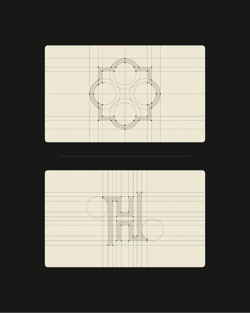
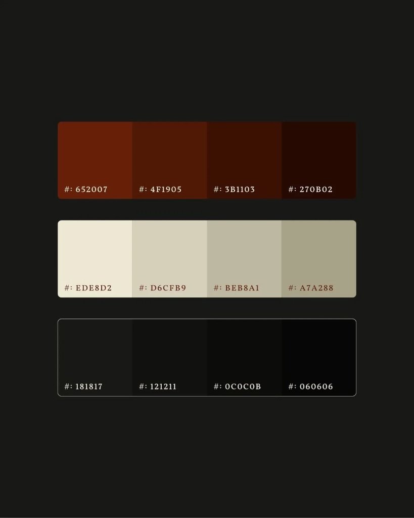
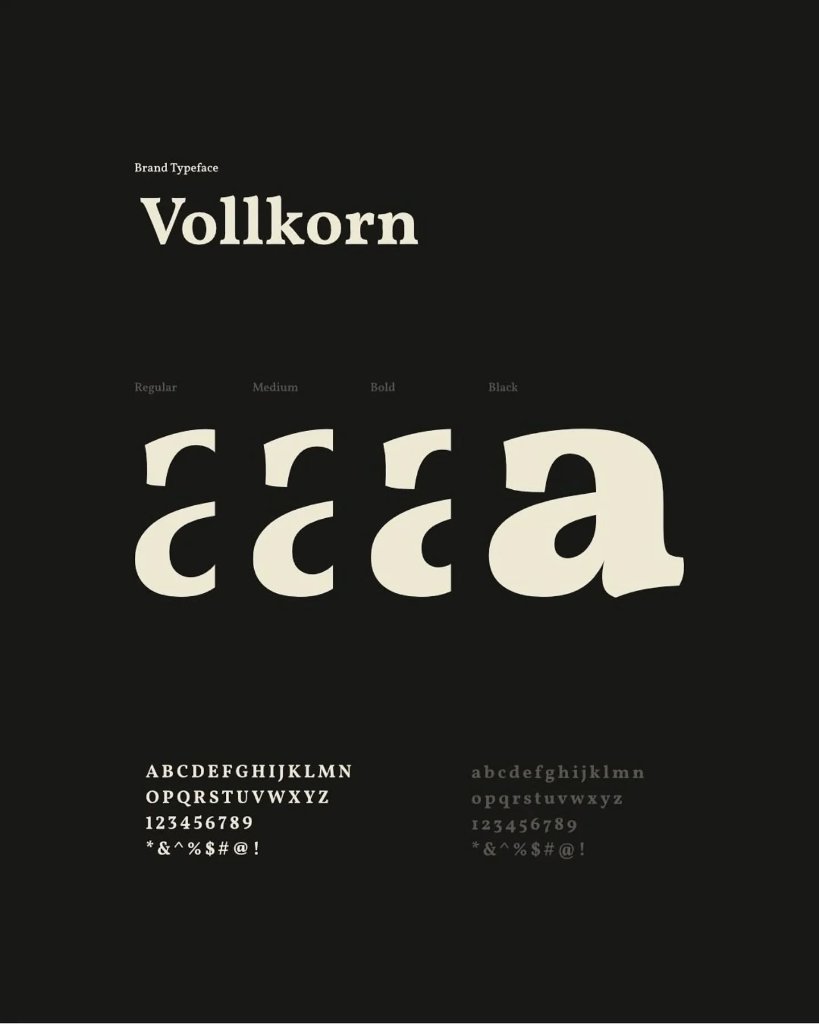
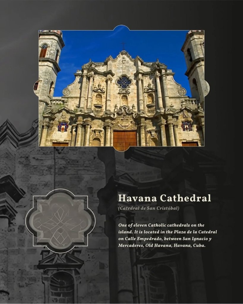
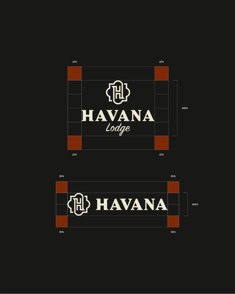
Havana Lodge is rooted in a specific place: Old Havana, where colonial stonework, cathedral façades, and centuries of history live on every corner. The brand needed to feel like it was carved from that same stone. A geometric 'H' monogram was constructed within a quatrefoil frame — a shape pulled directly from the arches of the Catedral de San Cristóbal. The wordmark pairs a heavy, high-contrast serif ('HAVANA') with an elegant script ('Lodge'), echoing the contrast between Havana's grand architecture and its hand-painted signage. A deep rust, cream, and charcoal palette was sampled from the city's own walls. Every element — from the Vollkorn typeface to the quatrefoil motifs — is a translation of Havana's texture into a modern brand system.
Palette
 01
 02
 03
 04
 05
 06