Call Now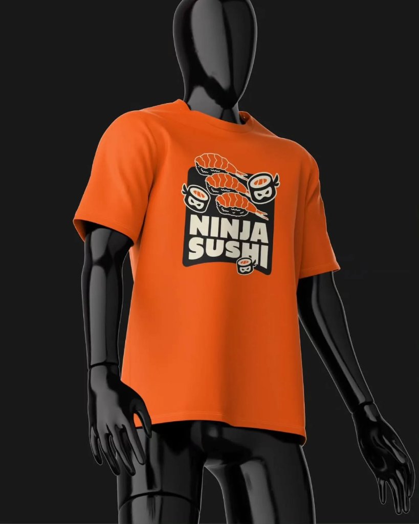 01
 02
 03
 04
 05
 06
 07
 08
 09
 10
 11
05 — 08 · Restaurant Branding
Ninja Sushi
Logo Design
05 — 08
Ninja Sushi
Logo Design
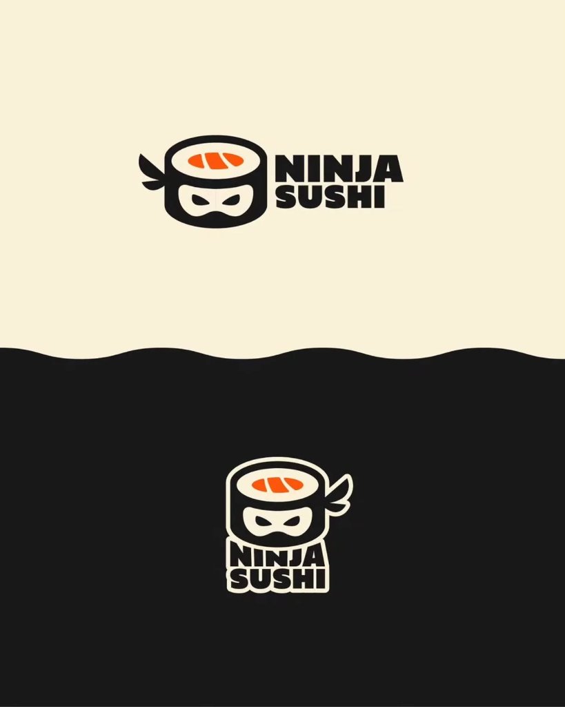
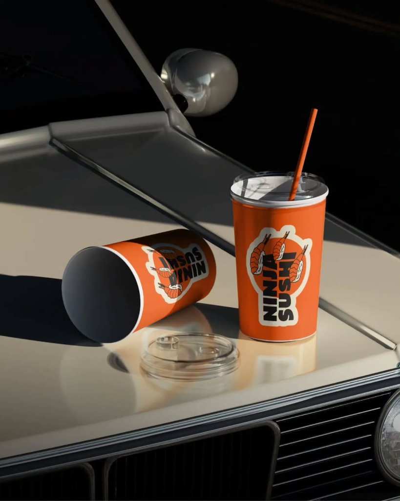
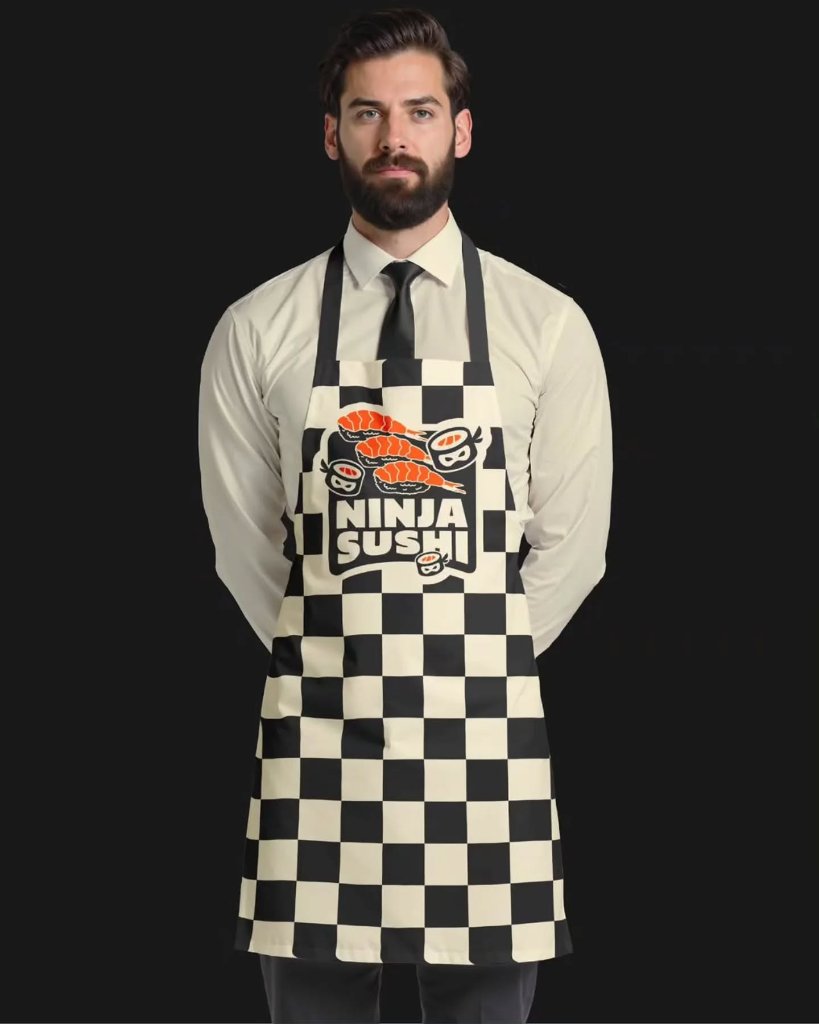
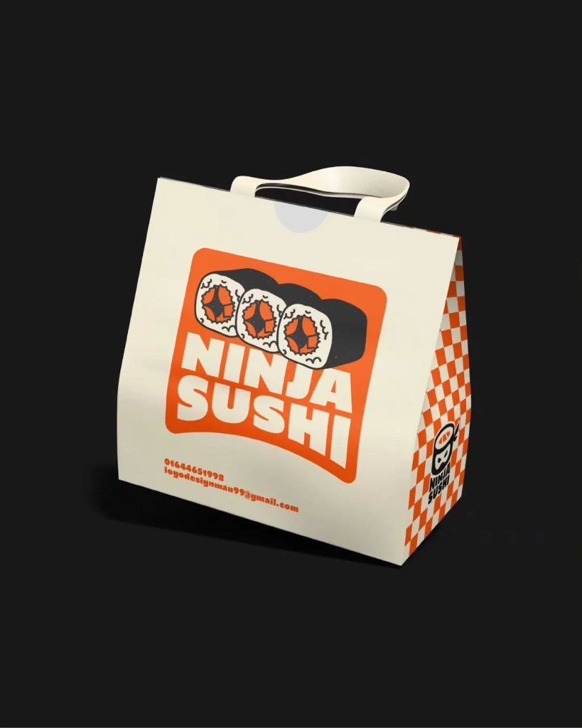
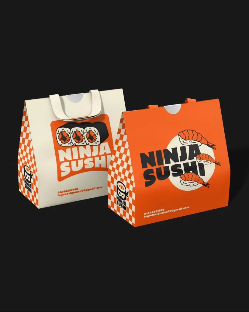
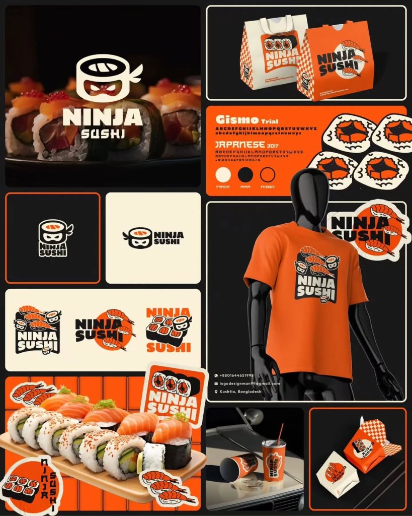
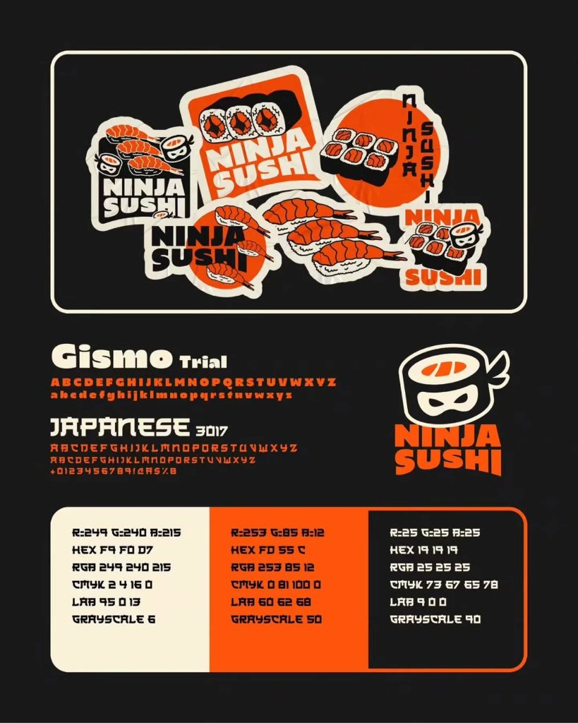
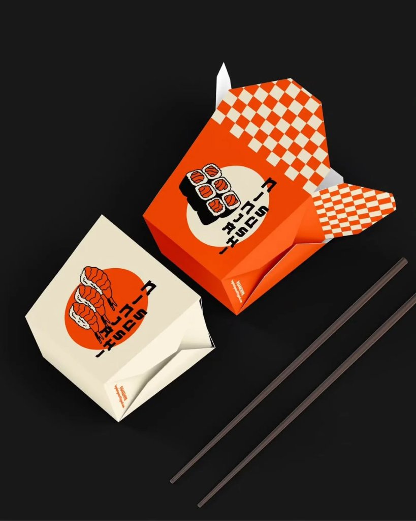
Ninja Sushi needed to stand out in a category where every competitor uses the same red-and-white, minimalist Japanese aesthetic. The concept was bold: what if the sushi itself was the ninja? A sushi roll wearing a ninja mask became the mascot — playful, memorable, and instantly ownable. The vibrant orange and cream palette is unexpected for sushi, which is exactly the point. A signature checkerboard pattern ties together every touchpoint — takeout bags, cups, apparel, and packaging — creating a brand so visually distinctive that you'd recognize it from across the street. It's not trying to be authentic Japanese. It's trying to be unforgettably Ninja Sushi.
Logo DesignBrand IdentityPackagingApparelPattern System
Palette
Cream
Vibrant Orange
Charcoal Black
0102030405060708091011