Clay
Logo Design
Clay
Logo Design
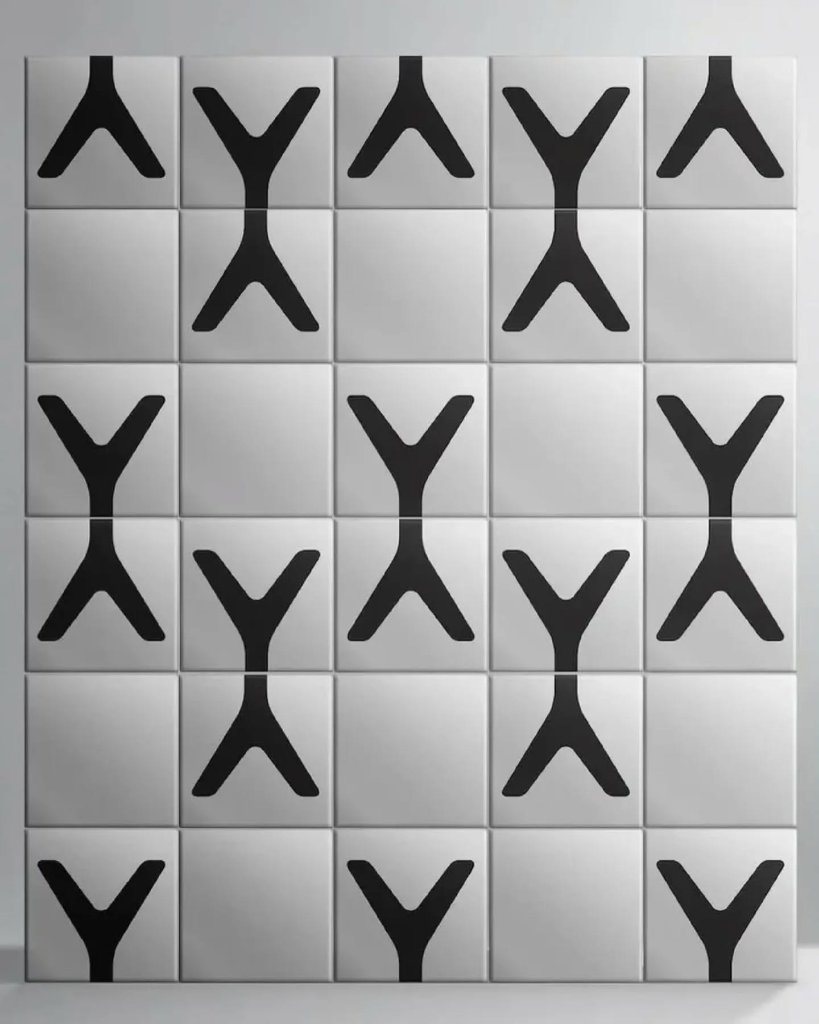
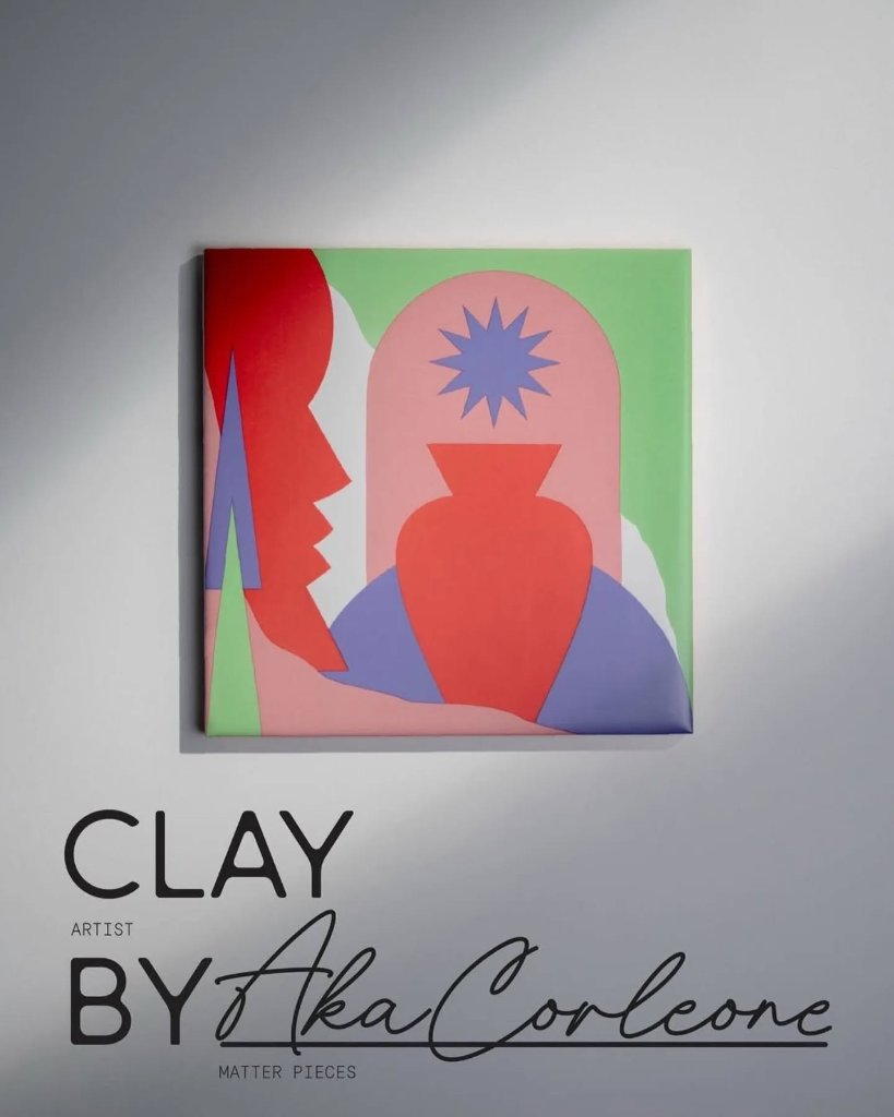
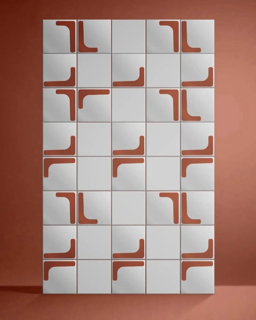
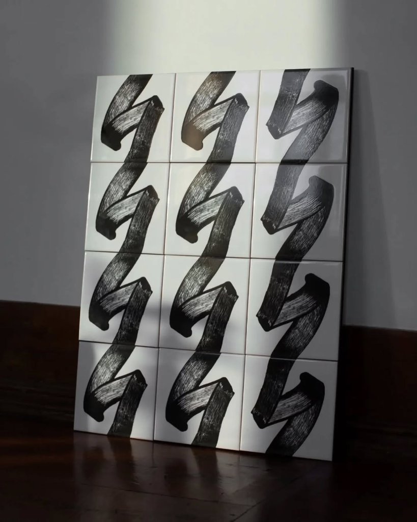
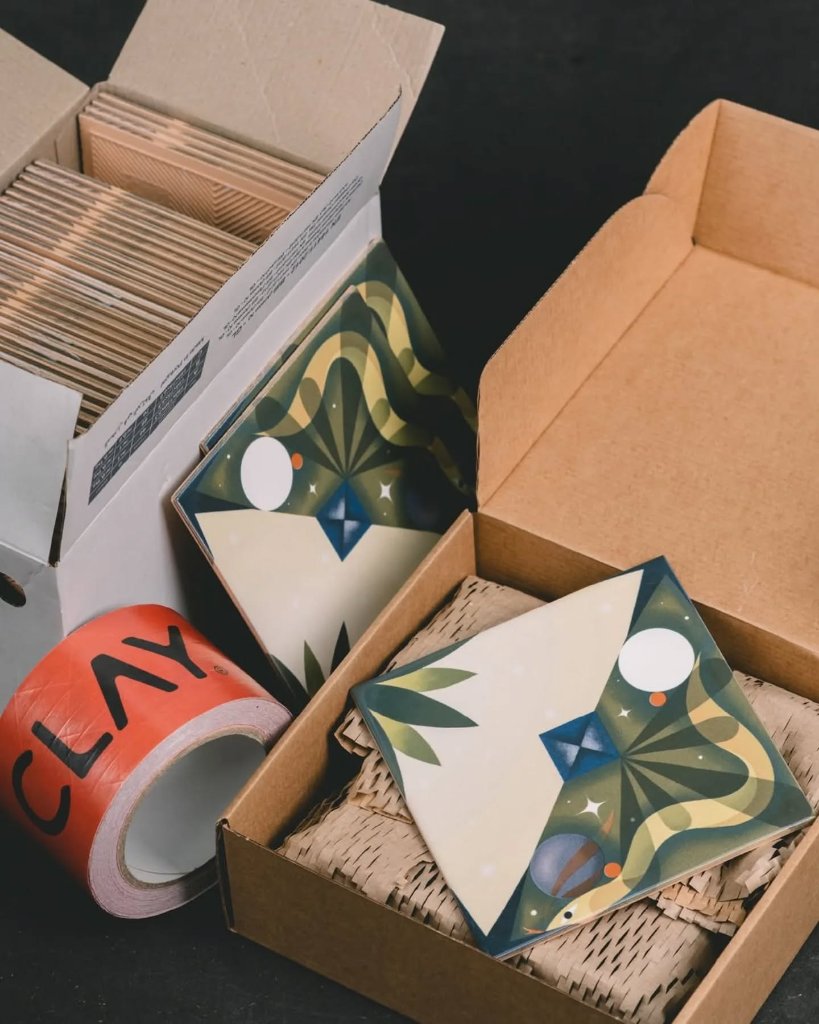
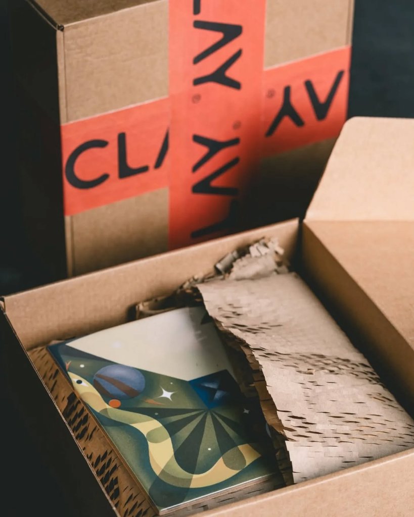
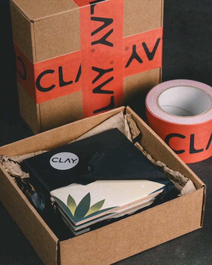
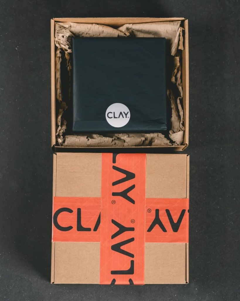
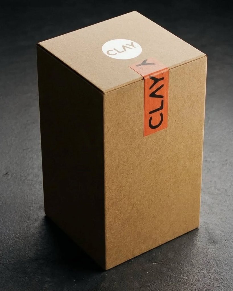
Clay isn't just a tile company — it's a canvas. The brand treats every ceramic surface as a piece of art, collaborating with street artists and painters to translate their work into modular, collectible tile systems. The identity itself is deliberately understated: a bold, black sans-serif wordmark with a registered mark, set against a terracotta palette sampled from the raw material itself. That restraint is strategic — it lets the artist's work be the loudest thing in the room. The packaging system is where Clay's brand truly lives. Bright orange-branded packing tape, circular logo stickers on matte black tissue, and kraft cardboard boxes turn every unboxing into a gallery opening. Each artist collaboration — from Jon One's brushstroke grids to Aka Corleone's geometric profiles — gets its own 'Matter Pieces' editorial treatment, with the artist's signature rendered in elegant script alongside the Clay mark. The result is a brand that feels less like a product and more like a curated art collection you can install on your wall.
Palette
 01
 02
 03
 04
 05
 06
 07
 08
 09
 10
 11
 12