Call Now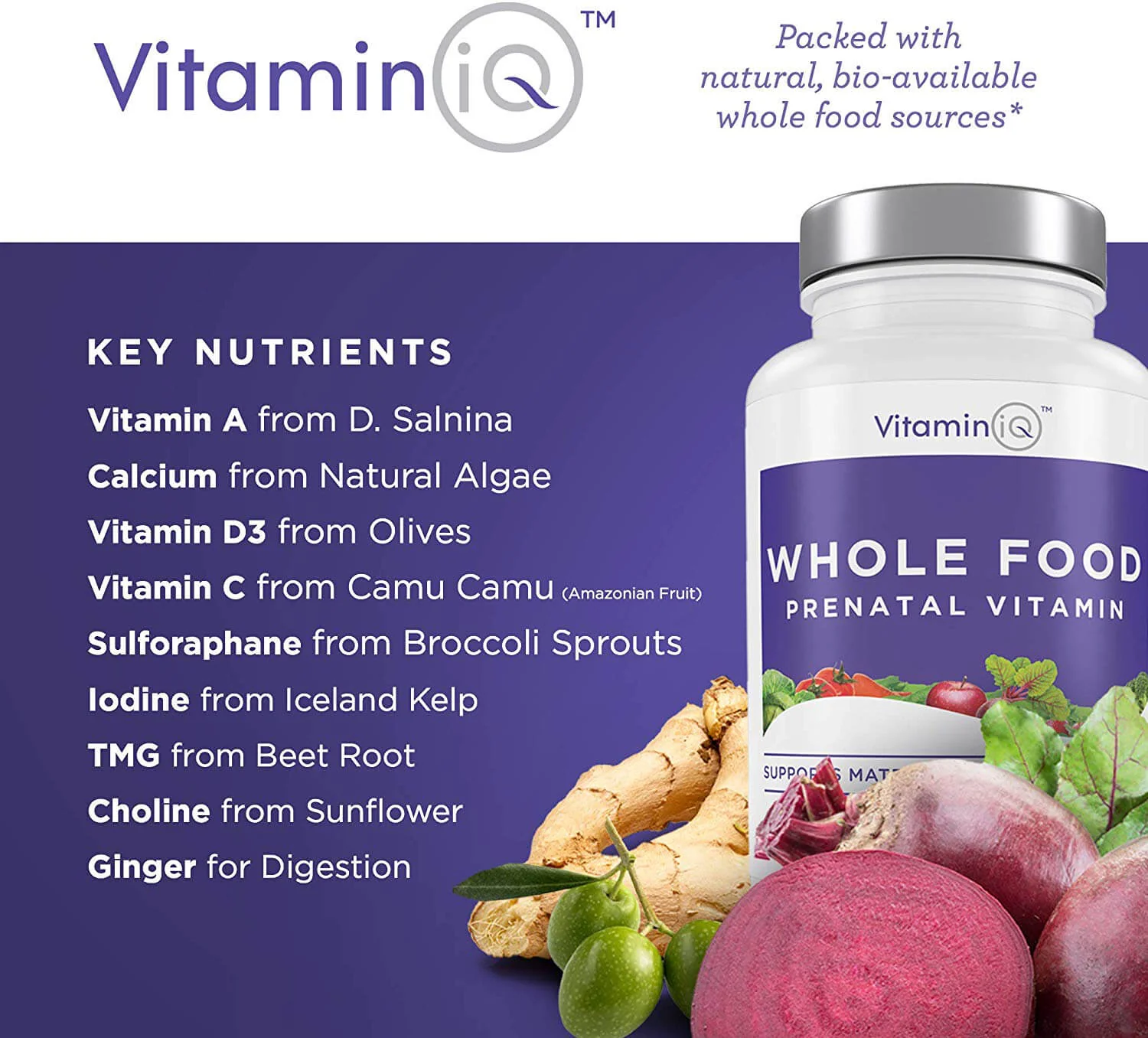
 01
 02
 03
 04
 05
 06
 07
 08
 09
 10
04 — 08 · Rebrand
Vitamin iQ
Logo Design
04 — 08
Vitamin iQ
Logo Design
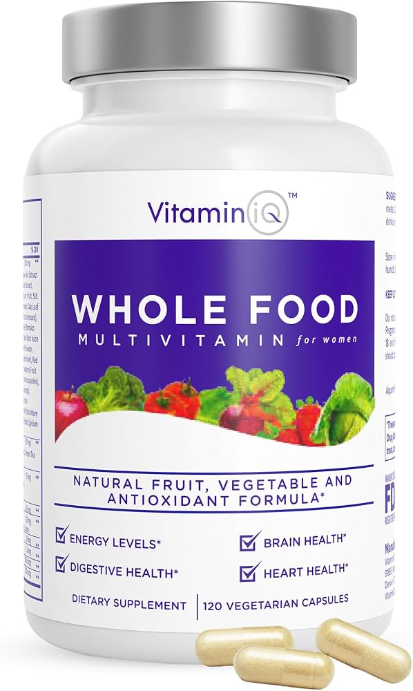
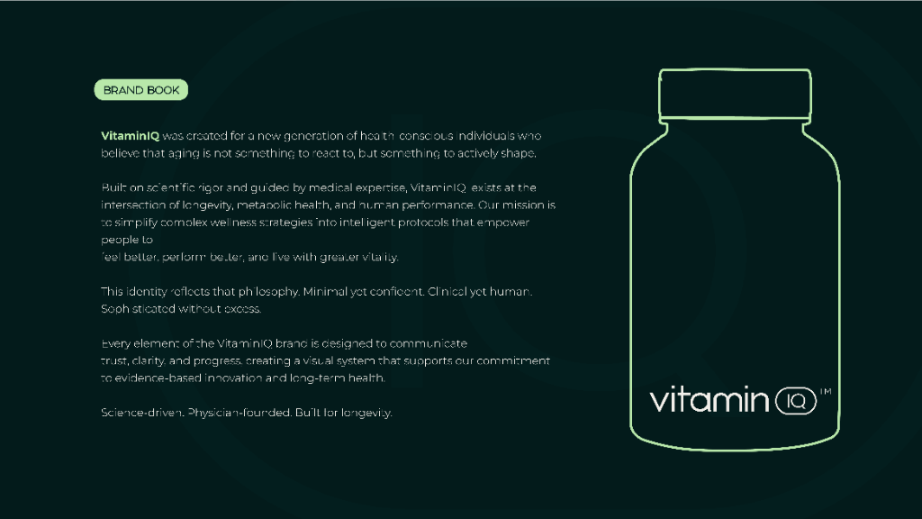
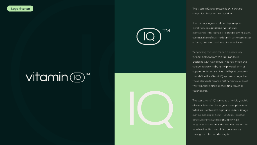
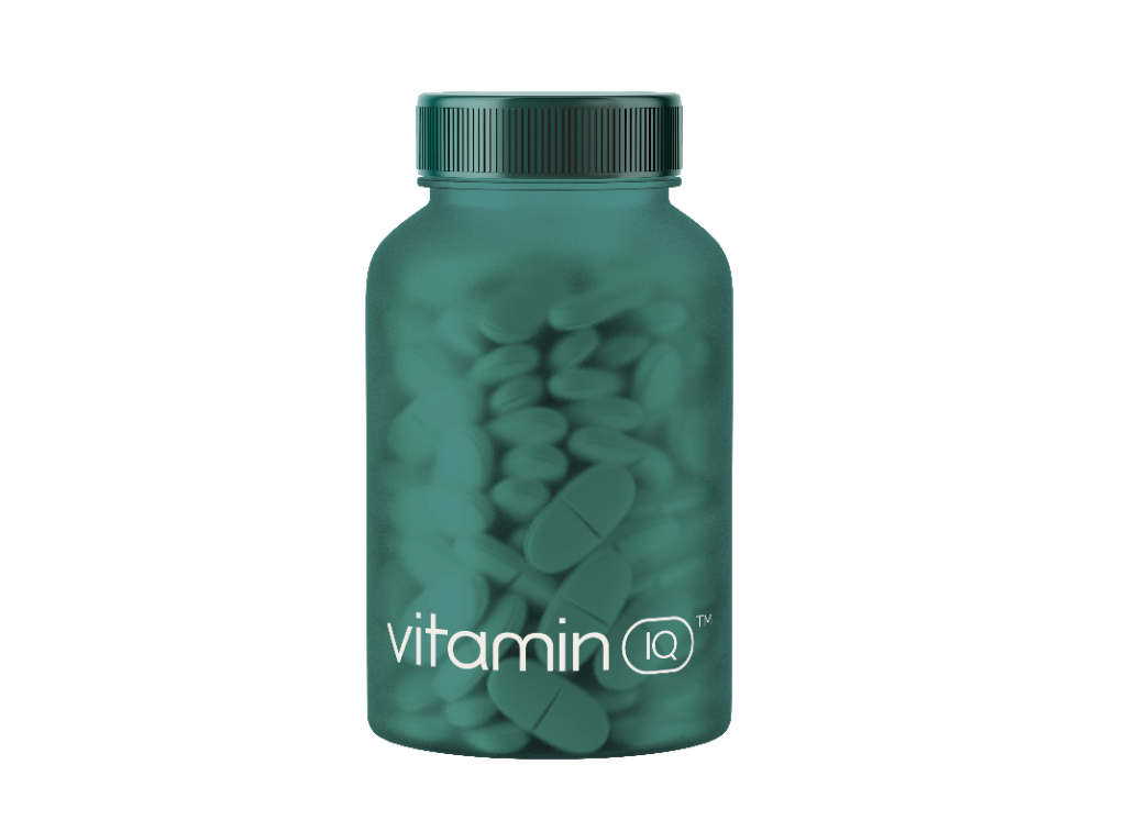
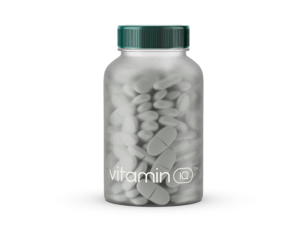
Vitamin iQ had a credibility problem. Their old branding looked like every other supplement on the shelf — synthetic, clinical, forgettable. But their product was the opposite: real, whole-food-sourced nutrients. The rebrand closed that gap. A deep forest green and sage palette signals nature and bio-availability, while the modernized logo system and produce-driven label design tell shoppers exactly what they're getting before they read a single word. The before-and-after tells the whole story: from 'lab supplement' to 'whole food nutrition' — without changing the product, just how the world sees it.
Logo DesignBrand IdentityPackagingRebrandLabel Design
Palette
Deep Forest
Dark Teal
Sage Green
Off-White
Before
After
01020304050607080910